
Figma | Research
Redesigning the Mobile App for a Public Library Informed by User Insights and Qualitative Testing
Located in Columbus, IN, the Bartholomew County Public Library (BCPL) is the community crossroads - connecting people, ideas, information, and experiences to empower everyone on their journey of lifelong learning. This project presents an approach to solving problems faced during a user’s experience navigating library resources through updated information architecture and UI.
This project is an unsolicited redesign and was completed as part of an academic exercise. It does not represent a real project with BCPL. All ideas and opinions presented in this case study are my own and do not reflect those of the BCPL.
Project Overview
ROLE
Sole UX/ UI Designer, UX Researcher
CHALLENGE
Design a new mobile library app to help improve a user’s experience interacting with library resources including checking out materials, attending events, and identifying library hours
DURATION
November 2023 - March 2024
SCOPE
SOLUTION
-
Design a new app that helps users browse a library catalog, place holds, and renew materials without the physical library location
-
Design an app that allows users to easily register for and keep track of upcoming events they’ve registered for
Redesign the Bartholomew County Public Library mobile app to be more user friendly
TOOLS
Figma, Miro
Project Goals
Enhance Usability
Reduce the average time for users to place a hold on a book by 30%
Boost User Retention
Increase the monthly active users by 20% within three months of the redesign launch
Improve UI
Improve the average user rating of the app's visual appeal from "negative" to "positive" in post-usability testing surveys
Anticipated Outcomes
30%
Time to Place A Hold Reduced by
Within two months of the redesigned app's launch
20%
User Retention Increased by
Within six months of launching the app
60%
Improved User Satisfaction
Of users surveyed felt the new app was more visually appealing than the previous
The Final Design
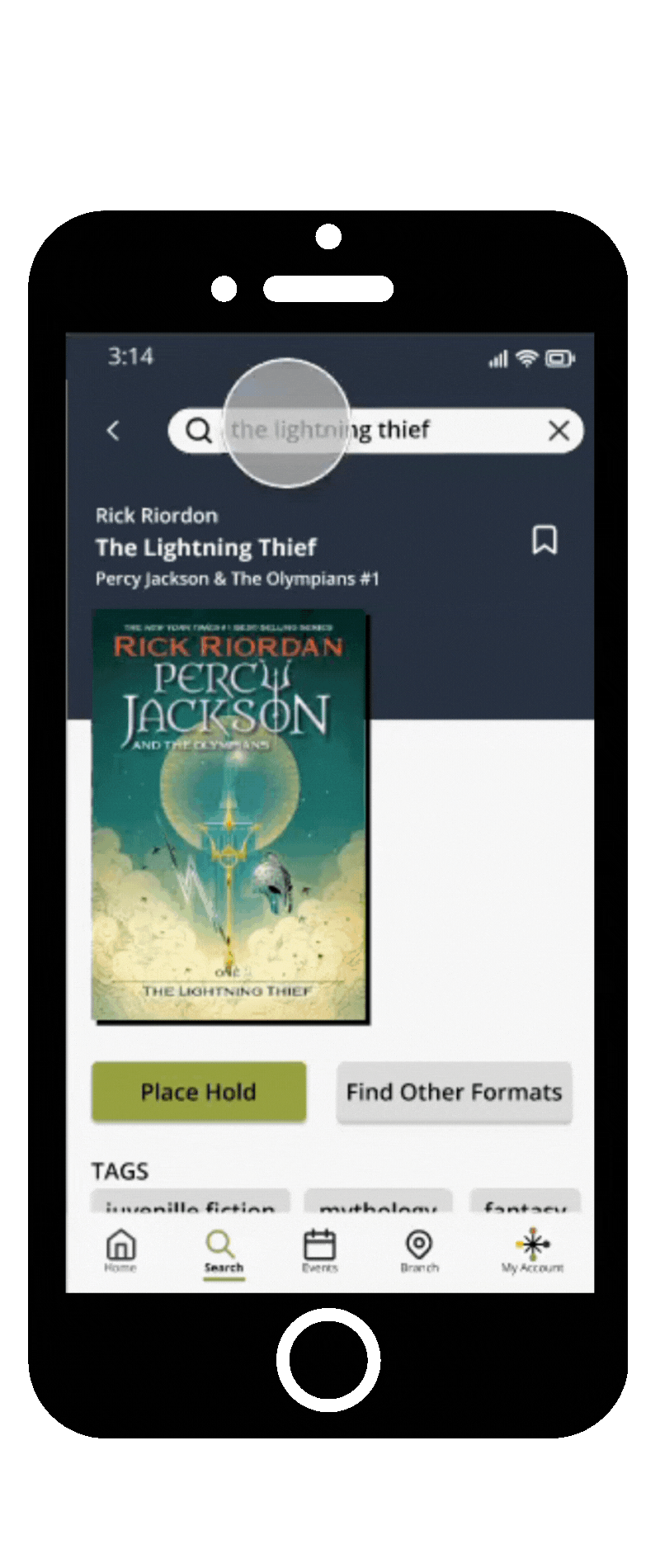
Users can easily place a hold in just three taps: initiate the process, select a pickup location, and submit. After placing a hold, they have the option to return to their search to add more holds or view their held items to confirm the placement, ensuring a smooth and efficient experience.
Held items ready for pickup are automatically prioritized at the top of the screen, with the pickup date highlighted in bold text and color to capture users' attention. The previous app required users to scroll through all holds to find those ready for pickup, which created a pain point. This design ensures that the pickup information is front and center, streamlining the user experience.
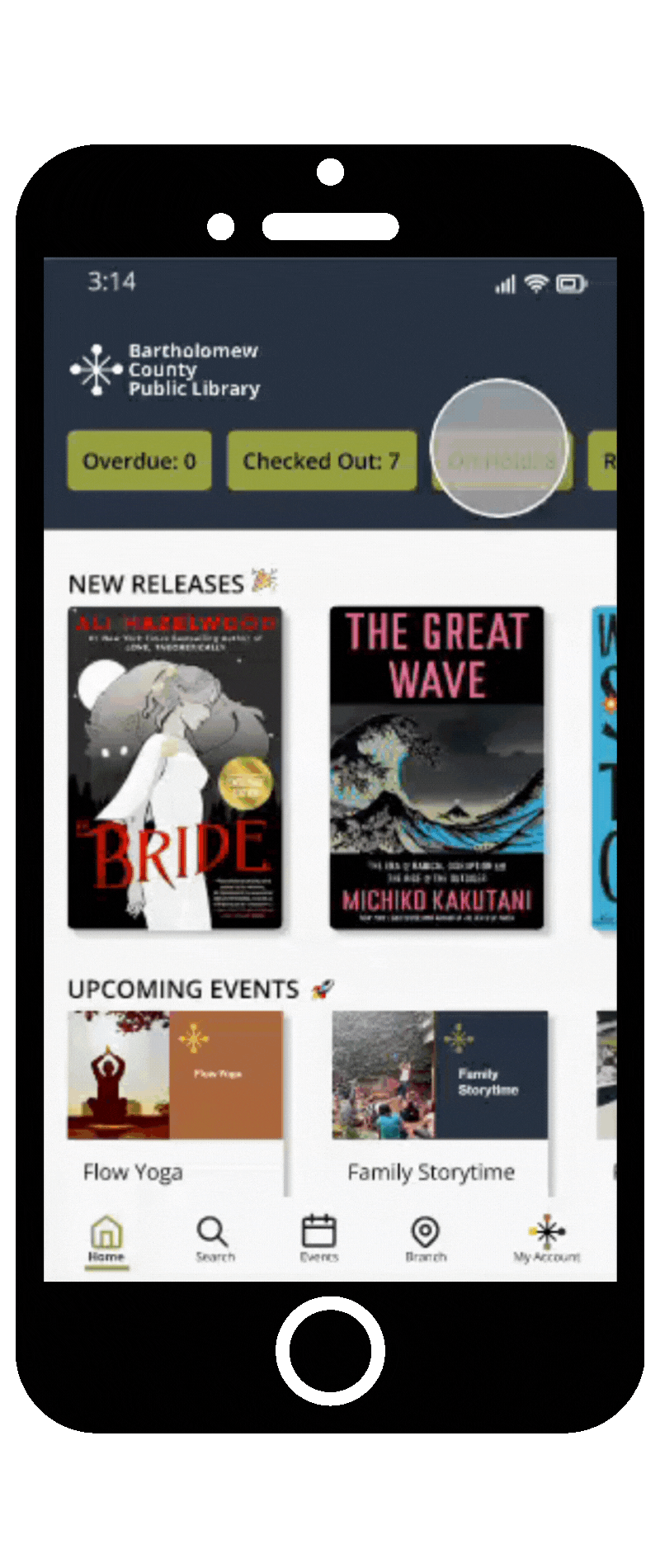
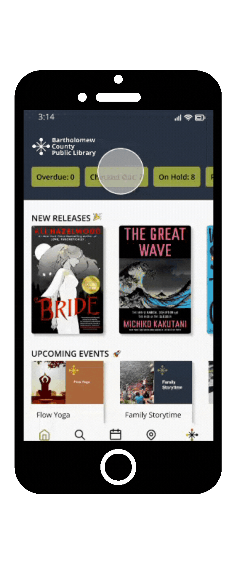
Users wanted to track their checked-out items easily, so I designed a dynamic ribbon with buttons for checked-out, held, and overdue items, each displaying real-time counts.
The previous app's Home Screen featured 18 tiles that primarily linked outside the app, prompting users to express a desire for a more integrated experience. Inspired by this feedback, I ensured that users can manage all activities seamlessly within the app, while also highlighting new releases and upcoming events.
Users can quickly renew an item they have already checked out by navigating to their list of checked out items. They may opt to renew a material by self-selecting the renew button or renew all items simultaneously. If an item is unable to be renewed, a message will appear with an explanation that prompts the user to place a hold on the material.
Navigating the Home Screen
Renewing an Item
Placing a Hold
A Glance at My Process

Understanding the Industry
To understand current trends surrounding mobile apps for public libraries, I began by conducting secondary research through a competitive analysis. Then, I conducted a heuristic evaluation of the existing BCPL mobile app using Jakob Nielsen's 10 general principles for interaction design.
Findings from Heuristic Evaluation
I wanted to learn what type of apps are being used by regional and national public libraries, so I conducted a UX competitive analysis. A few highlights can be found below.
Cincinnati & Hamilton County Public Library
Strengths
Weaknesses
-
Book detail page feels like Amazon Kindle app
-
Simple, easy to review layout for navigation including labeling system
-
Must have library card to view app
-
Can’t connect family cards to account
Cuyahoga County Public Library
Strengths
Weaknesses
-
Search results made it easy to select the right type of material (instead of accidentally selecting a large print book)
-
Menu is in the bottom right corner
-
Home screen feels like a website, not an app
-
The app crashes/ freezes
-
Too much text
New York Public Library
Strengths
Weaknesses
-
Large collection
-
Many branch locations
-
Looks dated
-
Loading is slow
-
Takes a long time to use app
-
Searching isn’t good, doesn’t connect all media types
Survey of Library Patrons
I conducted a survey using Google Forms as preliminary research to establish users' current opinions of the mobile library app. This survey was sent to individuals aged 22-60 of varying gender identity and educational backgrounds. Of 21 participants, 12 utilize the library at least once per month, while 19 participants utilize the library at least once per year. This survey provided insight into user pain points and helped me prioritize features that users expect to see.
"I love that I can have the library scan my phone. I'm always losing my physical card. I also love being able to put books on hold." -Survey Respondent
User Priorities
Of respondents stated placing holds on items is a priority
57%
Of respondents identified that searching the catalog is a priority
67%
When asked what features they expect to find in a library mobile app, all participants chose the ability to search the catalog, and 90% selected the ability to place a hold on an item, and to renew checked out items.

User Pain Points
1
Difficulty
searching the catalog
2
Too much information on home screen
3
Outdated UI (app looks like a web browser)
4
Redirecting to
website for presumed in app features
Organizing information... What a library does best
Information Architecture
Keeping in mind the features identified by users in the survey as important to find in a library app, I developed an architecture to guide the app development.

_edited.jpg)
User Flow
User flows were developed based on the following key tasks identified by users in the survey: searching for library materials, placing holds, renewing materials, and registering for events.
Iteration Isn't Just For Processing Data
Crazy 8's
To get idea to paper, I completed a Crazy 8's exercise for each screen type: Home, Search, Object Detail, Location, My Card, and Favorites.


User Flow to Sketches
I refined the sketches created during the Crazy 8's exercise to create an outline of each screen seen throughout the user journey. These workflows were created for each major task that a user might complete in the app: place a hold, renew an item, register for an event, reserve a room, and add to favorites.
Paper Prototype
Once each task had been outlined, I developed a paper prototype to test these ideas. I selected a paper prototype over a low-fidelity digital prototype because I wanted something easy to make and modify during early user testing.
As a result of a moderated usability study using the paper prototype, I learned that users were struggling to reserve a room and were consistently overlooking important headings and icons. The room reservation feature was not located in a place that was intuitive to users. Similarly, the headings and icons that users were overlooking did not have strong visual design hierarchy.

Testing High-Fidelity Prototype
Evaluation
After the first round of usability testing, I updated my designs and created a high-fidelity prototype in Figma. Once that prototype was complete, I scheduled a second round of user testing to evaluate the prototype. You can view my UX Research Plan for this study here.
Key Takeaways from Second Round of Usability Testing
1
66% of users had difficulty adding a book to one of their collections (favorites)
2
Users want additional context for why an item cannot be renewed
3
Users indicated that the UI for the digital library card looks broken
Accessibility Concerns
The following considerations were made during the design of this mobile app:
-
Color contrast - the colors in the BCPL brand did not provide adequate text/ background contrast when used together, so I utilized a neutral color for the text that had accessible contrast
-
Visual cues - used cues beyond just color to indicate state changes such as an underline in the navigation to indicate the active page
-
Accessible touch targets - I received feedback during testing that the touch targets were not large enough. This feedback led to a design that ensured buttons are large enough and spaced out for easy tapping
-
Simple layout and navigation - the app's structure was kept clear, simple, and predicatable
-
Meaningful accessible naming conventions - descriptive labels were used to interactive elements, such as buttons and menus, to ensure users could understand where they were navigating to
During both rounds of testing, individuals with disabilities were included. However, there is room for improvement regarding representation of individuals with disabilities for the recruitment of future usability tests.
Conclusions
If This Were a Real World Project the Next Steps Would Be...
Revise and Retest
I would plan to update the prototype with additional feedback received from users during testing. For the sake of this project, I only built out the key features requested by users. Before handing this design off to developers, I would want to fully build out the settings menu and login screens. With the new revisions and additional app features incorporated, I would retest my high-fidelity prototype to evaluate the ease with which users add materials to their collections.
Hand Off
After validating the design, I would handoff the design to the engineering team, or other stakeholders to develop the app.
Product Launch
After the app has been built, we would introduce the new product to the market. This app was designed for iPhone, so if we were actually launching this product, I would have built an additional version for Android so that the app can be sold on both the Apple App Store and Google Play Store.
Features
After the first version of the app has launched, I would observe how people use it, monitor ratings in the app store, and work on updating priorities and adding new features to the app based on the product roadmap.
Reflections
Indirect Competitor Analysis
When I conducted a competitor analysis, I did not evaluate indirect competitors outside of the industry such as the Amazon Kindle app, Audible, Barnes & Noble, Libby, etc. Indirect competitors can provide valuable insights into a business, including opportunities for differentiation, risk mitigation, and collaboration, and evaluating these competitors may have inspired me to take elements of the design in a different direction.
Growth as a Designer
I experienced tremendous growth as a designer from the beginning to the end of this project. This was my first experience developing an app within an existing brand and I was able to apply knowledge I learned through the Google UX Design Certificate program regarding typography and color theory. This project allowed me to create accessible designs, and I paid particular attention to ensure color contrast met WCAG compliance. In Figma, I utilized components and auto layout to create my designs, something that I had not previously done. I also utilized color contrast and map maker plug-ins. I plan to continue to practice using components and auto layout in Figma and to explore the use of additional plug-ins.
.png)

