Information Architecture | Research | Project Management
Creating an intuitive intranet platform for cross functional teams that increased site visits by 80%
ROLE:
TIMELINE:
CLIENT:
TOOLS:
Sole UX Strategist & Researcher
January - June 2024
Airline Tariff Publishing Company (ATPCO)
Aha! | Jira | Microsoft Teams | Miro | SharePoint
About ATPCO & Routehappy
ATPCO is the airline industry’s source for fare and merchandising data. Its Routehappy product provides rich content that enhances airline offers and shopping experiences worldwide.
The Routehappy teams spanning Product, Engineering, Marketing, and Customer Success needed a shared platform to store and access documentation, but their legacy SharePoint site was confusing, outdated, and largely unused.

What Changed
ATPCO’s Routehappy SharePoint site was a disorganized knowledge hub that few teams used.
I led a UX and information-architecture overhaul to transform it into a centralized, intuitive intranet platform that unified documentation, improved findability, and enabled cross-functional collaboration for 12 global teams.
Impact highlights
-
+80% increase in site visits within 30 days of launch
-
+65% increase in unique viewers over the same period
-
1,956 files migrated and tagged with a new metadata schema
-
12 teams aligned around a single source of truth for Routehappy documentation
Before

After


The Problem

Challenges
-
No single source of truth; information spread across Teams, email, and legacy SharePoint pages
-
Users were unaware of existing resources or how to locate them
-
Redundant folder labels and poor metadata hurt findability
-
Existing page difficult to scan with information hidden in accordions
-
Outdated content and no defined governance process
Why It Mattered
Inefficient knowledge sharing was slowing product delivery and creating information silos between cross-functional teams that rely on Routehappy data daily.
My Approach
Ownership: Sole designer and researcher responsible for research, information architecture, content strategy, and governance.
Discovery & Research
-
34 discovery calls with employees across 12 teams (Product, Content Creation, Sales Excellence, Accounts, Marketing/Strategy, Training, Distribution & Standards, Development, and Operations)
-
Audit of existing SharePoint and Teams channels to analyze document overlap and usage
-
Heatmap synthesis in Miro to cluster pain points and identify user goals

Key Insights
-
No consistent definition of “Routehappy” across teams
-
Most users shared documents via Teams chats rather than SharePoint
-
Users wanted quick links and clear definitions instead of nested folders
-
Content needed to be kept current to build trust in the system
Prioritization & Project Planning
-
Partnered with senior product managers to classify requested features as high, medium, or low priority
-
Outlined 8-step project plan in Jira and Aha! aligned with Routehappy’s product roadmap
-
Created success metrics for launch: site engagement, content accuracy, and user adoption

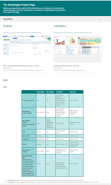
Information Architecture & Design Strategy
-
Developed a new site map based on document type and user task
-
Introduced team-specific pages under “Product Overview”
-
Established a managed taxonomy with tags for document type, keywords, associated team, and privacy status
-
Validated IA through multiple iterations and feedback sessions with stakeholders

Sketching & Prototyping
-
Used Crazy 8’s exercise to generate layout ideas quickly
-
Built sandbox prototype in SharePoint using out-of-the-box components
-
Refined layouts based on focus-group and 1:1 feedback sessions


Testing & Feedback
-
Conducted two focus groups and three 1:1 sessions with Product, Content, and Operations teams
-
Mapped feedback using color-coded sticky notes in Miro by theme (e.g., “navigation,” “content,” “visual hierarchy”)
-
Iterated on homepage features and repository navigation based on direct user input

The Solution
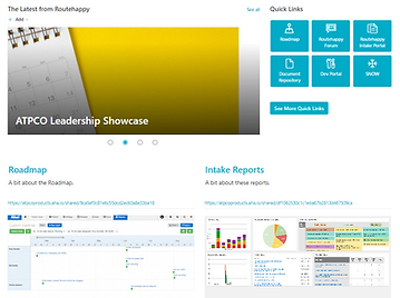
A Snapshot of All Things Routehappy
-
Quick access: Key links and roadmap information visible above the fold
-
Dynamic updates: Rotating news banner with product announcements and team updates
-
PTO calendar: Integrated for team availability visibility
-
Unified navigation: Top menu to Document Repository, Cross-Functional Team Pages, and Product Resources
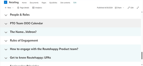
Socializing Content & Transparency
-
Dedicated team pages under “Product Overview”
-
Each page included key documents, resources, and team member bios
-
Some teams added unique elements (e.g., engineering practices accordion, content team newsletter)
Resources at Your Fingertips
-
Created “Quick Links” page grouping definitions, libraries, and training resources by type
-
Simplified navigation for users who needed to find specific content quickly
Document Repository
-
Migrated 1 ,956 documents to new repository and applied metadata schema
-
Implemented managed taxonomy ensuring consistent tags and governance
-
Improved content discoverability and flexibility through filtering and metadata
Impact
Validated Results
-
+80% increase in site visits in first 30 days post-launch
-
+65% increase in unique viewers compared to previous site
-
Improved findability and engagement: Users spending longer per session
-
Stakeholder feedback: “Finally a place where we can find what we need”
-
Knowledge standardization: Metadata framework adopted by other Routehappy workstreams
Final Takeaways
Simplicity Scales
Users prefer intuitive organization over custom features.
Governance Drives Sustainability
Defined ownership and review cadence ensured ongoing accuracy.
Cross-functional Empathy
Understanding how teams use and consume information informed IA decisions.
Research Builds Buy-in
Using user data and feedback to prove value secured stakeholder support.
Iterate as Culture
Positioned SharePoint as a living system evolving with ATPCO’s needs.
.png)
.png)